
 Gonzalo TéllezFideos El Triunfo
Fideos El Triunfo
Noodles and pasta since 1950. Starting from its brand, I built a bilingual design system that organizes its site and serves as the foundation for its delivery app.
Explore the siteA site that already existed and a brand with few rules
Fideos El Triunfo has made noodles and pasta in Lima since 1950. Its site was live and the brand had guidelines for social media, but nothing said how a button behaves, how a product page is built or which contrast is legible. It needed to put the site in order and lay the groundwork for its delivery app.
From guidelines to a living system, in four decisions
- 01I turned the brand into interface resources.
The diamond, the temple, the flower, the cloud and the bands went from ornament to signal: they mark sections, titles and transitions.
- 02I built a bilingual design system.
Components with their states, contrast measured against the brand colors, voice and tone, and the classes and variables used to manage the site.
- 03I organized the catalog and the recipe book.
Product pages and recipes share one template, and recommendations fill in on their own based on each recipe's tag.
- 04I optimized the site page by page.
I applied the system to the home, products, recipes, history and app pages, and measured every spacing in production.
A single source of truth for the brand and its website
The system brings together the brand's identity and the design decisions behind its website: color, typography, ornaments, components, patterns, navigation, accessibility and voice, plus the variables and classes used to manage the site. It is the foundation of the site and its future apps, and everything it states is measured in production.
Foundations
- 01Brand
- 02Color
- 03Typography
- 04Ornaments and icons
System
- 05Components
- 06Interface feedback
- 07Patterns
- 08Navigation
- 09Responsive
- 10Templates
Guide
- 11Accessibility
- 12Voice and tone
- 13Variables
- 14Handoff to the CMS
- 15Changelog
With a live sample on this page
Two accents and six brand shapes
The palette is short on purpose and the site uses no illustrated icons: it repeats brand shapes that read as signals.
Red and green, black and white. The two accents never mix in the same piece: red opens and green supports. Each color has its variable and its equivalent in the site's CMS.
The diamond, the temple, the flower, the cloud and the bands go from ornament to signal: they mark sections, titles and transitions, and take on the color of their section.
One template for products and recipes
The catalog and the recipe book share the same pieces, so they look like one family and are maintained from one place.
All twelve product pages come from one template. Labels and values share a line height so they align on the same grid, and one change to the template fixes them all.
Each shape has its own radius and no new ones get invented. The 25 is the site's signature: photos, frames, forms, the banner and even the Instagram iframe.
Variables that run the site
The site is edited through global variables in its content management system. Change one and every page that uses it changes too. These are three of its families.
- --rojoRed · opens the home and recipe pages
#EC1C27 - --verde-1Green-1 · buttons
#009964 - --verde-2Green-2 · footer and app banner
#06704B - --verde-suaveLiteral in the chip class
#E8F3E9 - --negroBlack · text
#272727 - --grisGray · secondary text
#8A8383 - --gris-medioMid gray · section backgrounds
#F5F4F3 - --fondoPage background
#FFFFFF - --lineaLiteral in the cards
#E4E4E7
Soft green and Line are literals in the classes, not variables, just as on the site.
- --radio-imagenPhotos, frames and forms
25px - --radio-pildoraChips
30px - --radio-botonButtons, across their 4 classes
60px - --radio-desplegableDropdown menu
12px
The 25 is the brand's signature on screen.
- --et-mov-durDuration of entrances
900ms - --et-mov-shiftDistance each entrance travels
24px - --et-escalonStagger per element, up to 3
110ms - --et-mov-easeOne curve for everything
cubic-bezier(.22,1,.36,1)
One curve for everything. Each dot moves with the duration and curve of its variable.
Photos and video recipes with Batan
Together with Batan we produce the product photos, the still lifes and the recipe videos. Each new recipe adds a photo, a video and its own entry.
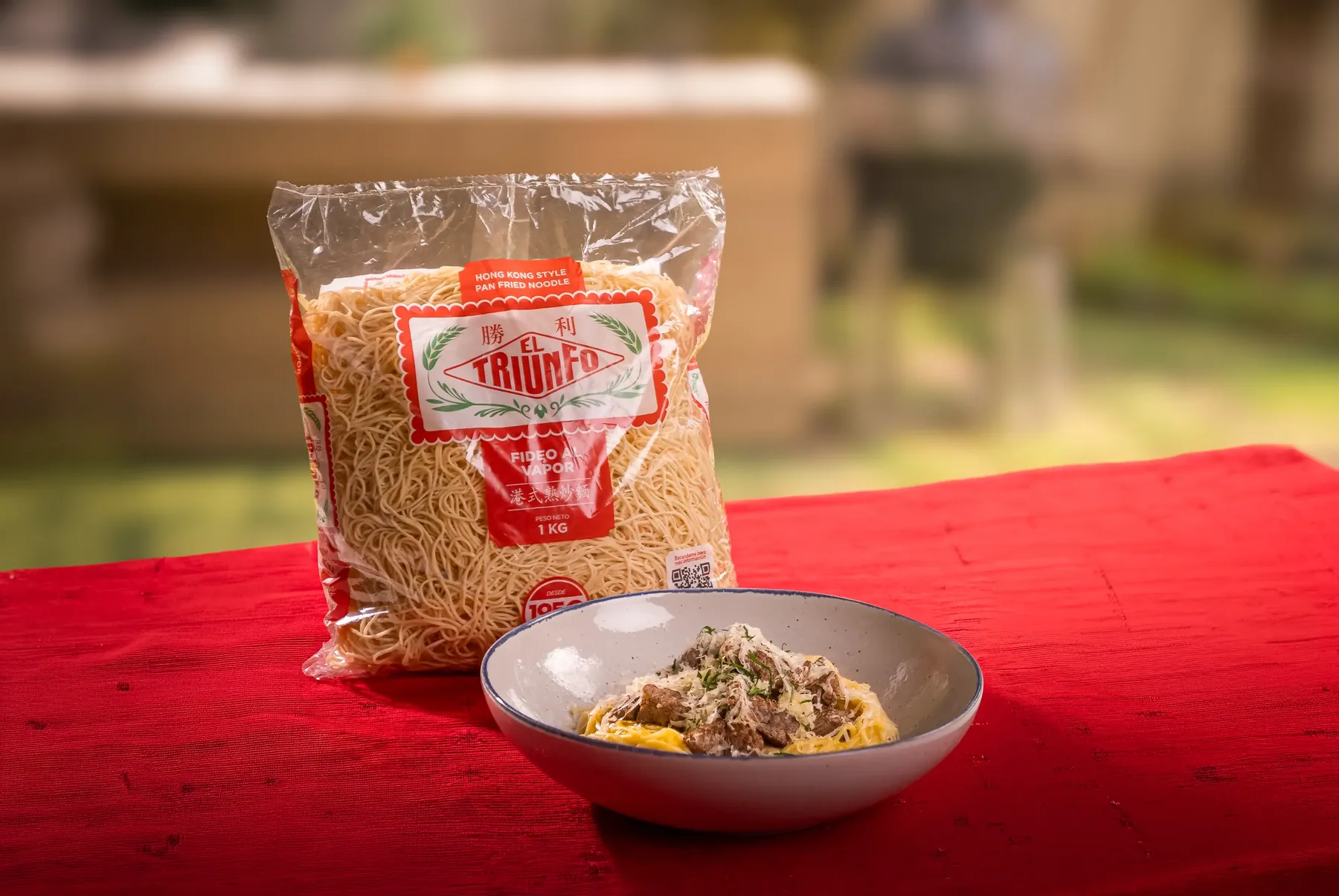
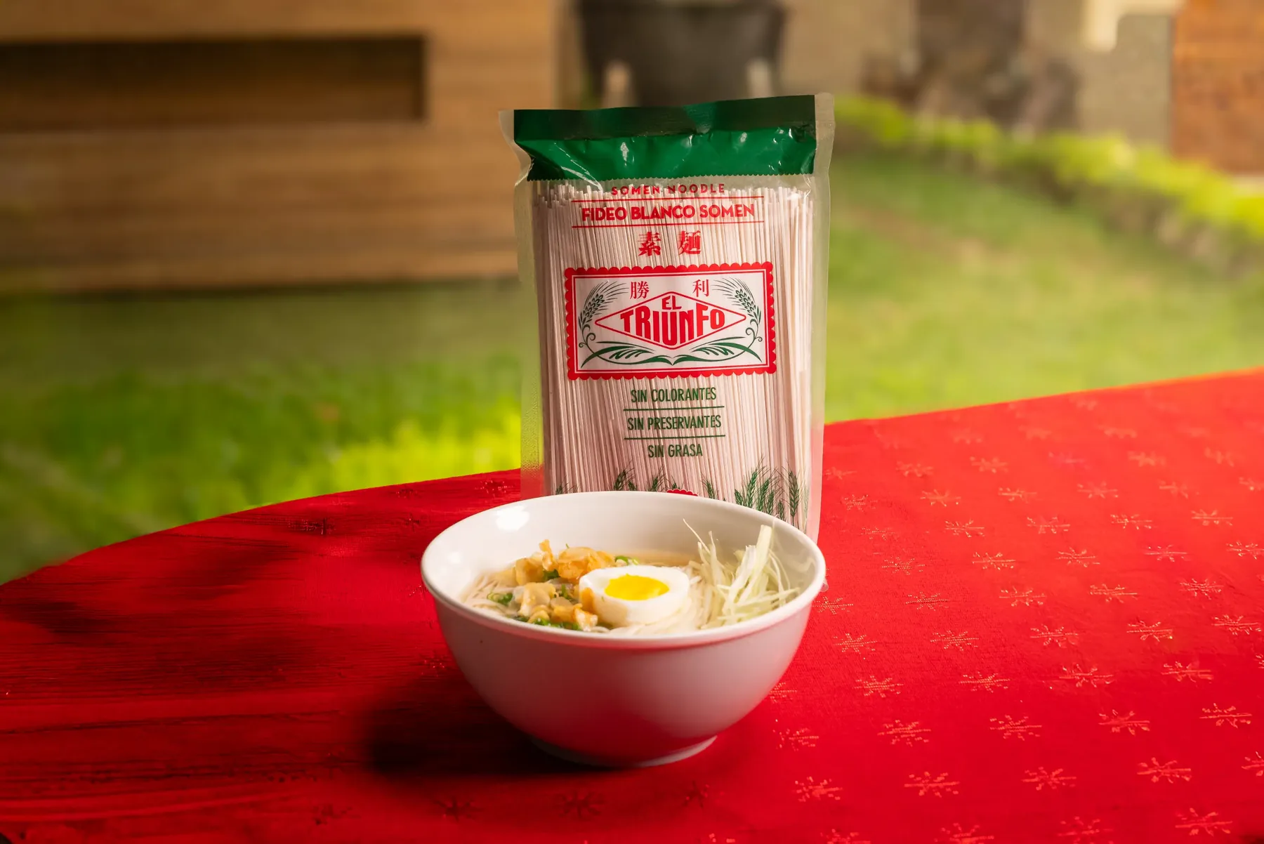
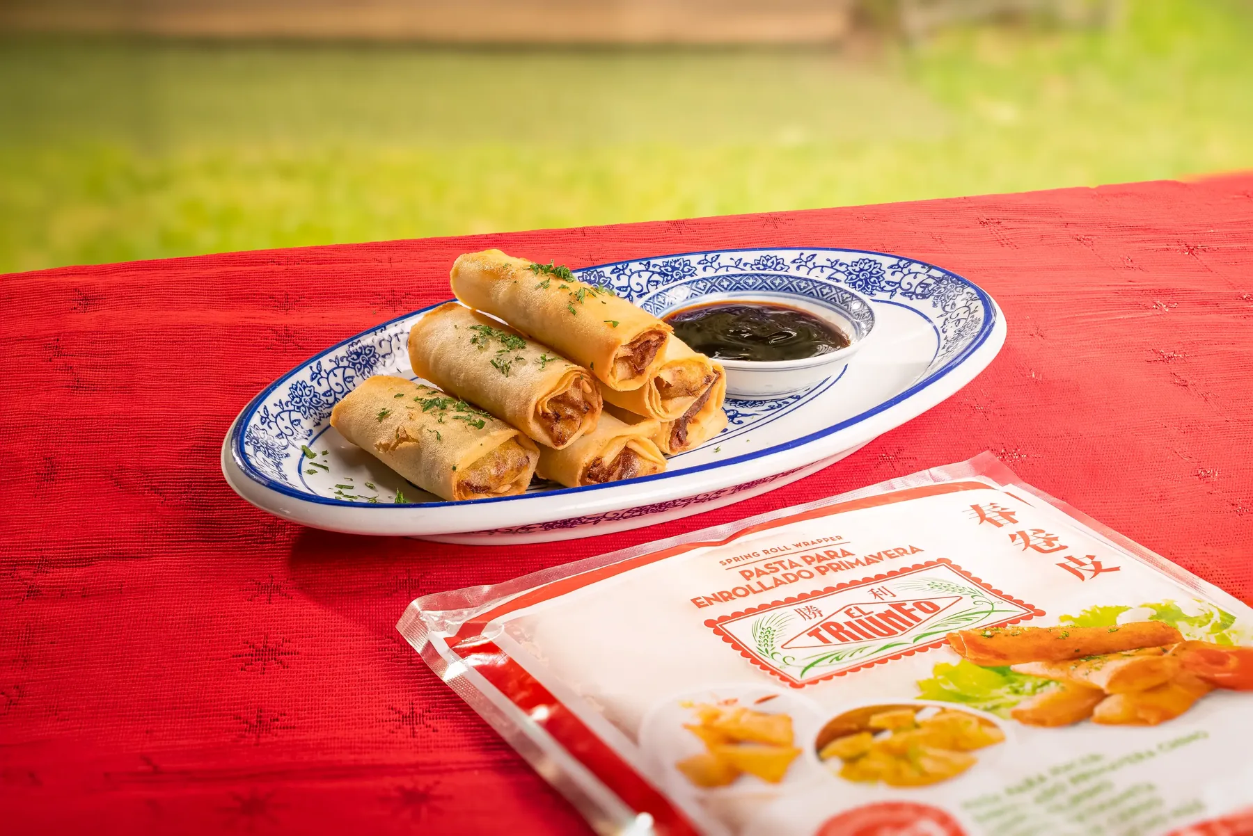
Still lifes from the photo session: carbonara, dashi soup and spring rolls, each with its recipe on the site.
A live site and a foundation for the app
The site is live with its catalog, product pages, recipe book, history and app page, and the system is the reference for what comes next.
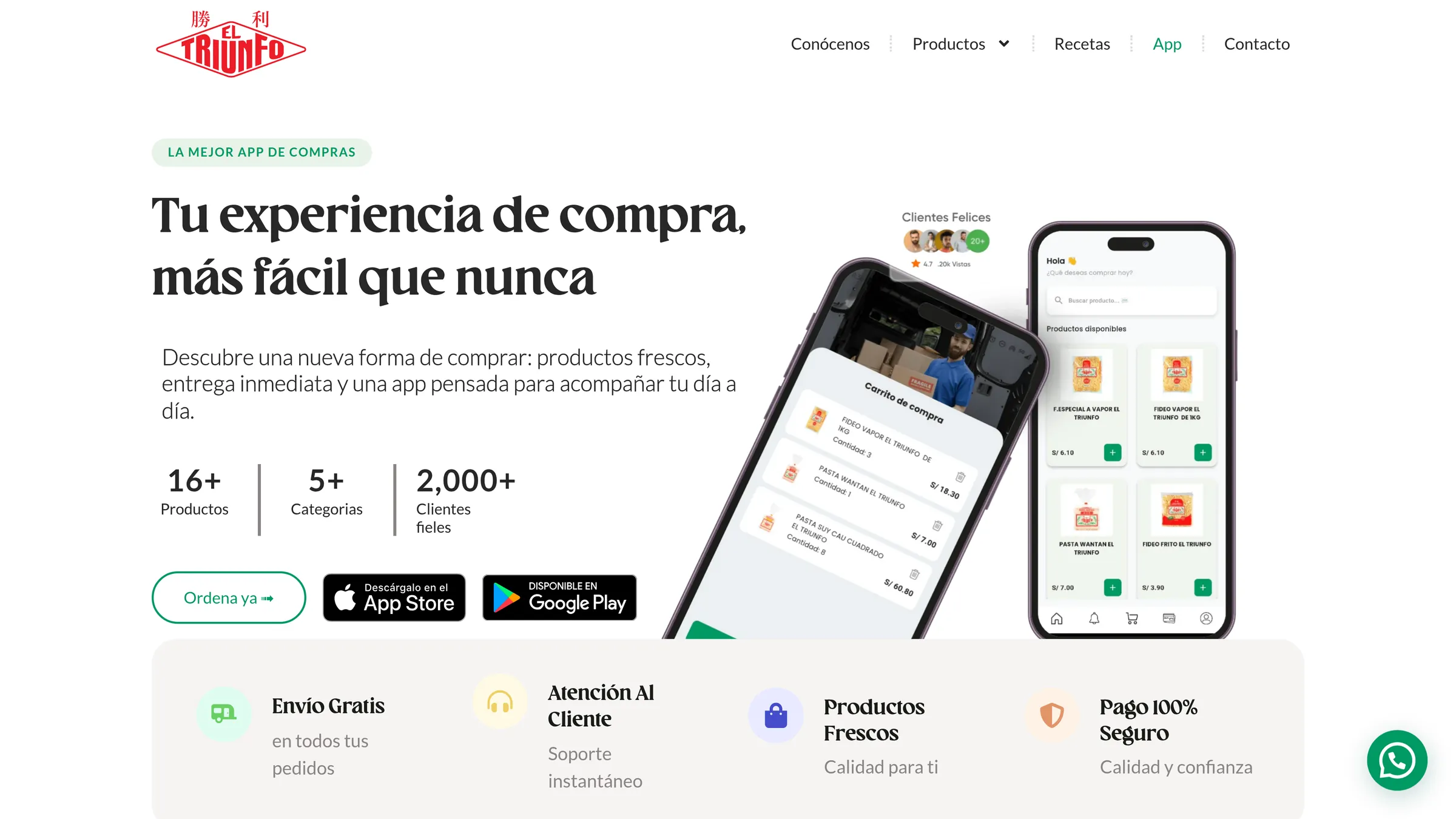
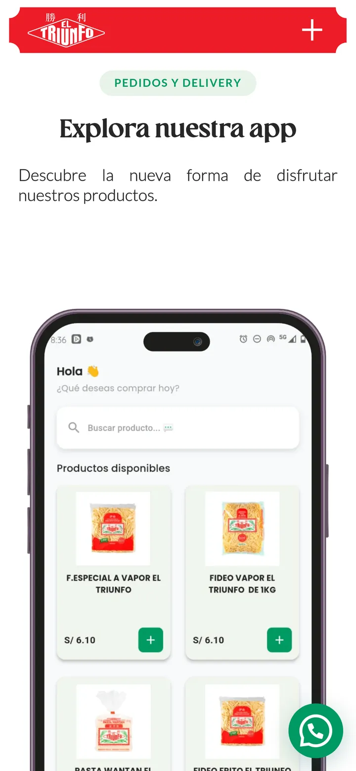
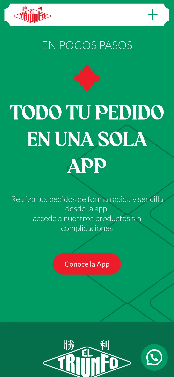

What you see on this page are live samples: individual pieces of the system, chosen to tell the case.
The full design system, v1.4, belongs to Fideos El Triunfo and stays in its hands.