
 Gonzalo TéllezBatan
Batan
An audiovisual production company for food brands, born from the team behind A Comer. I took its brand manual to digital, built its first design system, and designed and developed its new site.
Explore the prototypeA new brand that didn't live on screen yet
Batan comes from the team behind A Comer, the Peruvian video recipe collective. After its rebrand it had a brand manual built for print pieces and an old site that no longer reflected the new brand. It needed the identity to work in digital and a site that presented its work as a production company.
From the manual to the site, in four decisions
- 01I started from the manual and took it to the screen.
Custom functional icons, an app icon and favicon, and clear color and type roles for the web.
- 02I built its first design system.
A single source of truth for design and development: live components, light and dark mode, measured contrast and a handoff to the CMS.
- 03I designed the home page as a film set.
The camera moves through scenes and the services read like a menu.
- 04I developed the site on the system.
Every piece of the site comes from the system, with the same variables and the same states.
A production company that works like a kitchen
The site doesn't introduce a production company: it takes you into its kitchen. The pages are work stations and the team is a brigade, because at Batan every role has its counterpart in a kitchen. There's cooking there too, only what comes off the pass is content, design, branding and brand value. Hence the line that organizes the whole site: “from script to plate”.
Over the kitchen video, the bar and the cards are glass: you read the background through them, with transparency and blur, never with an opaque block.
A single source of truth for design and development
The system takes the brand to the screen and gathers the decisions from the site prototype: brand foundations, color in light and dark, typography, iconography, components with their states, interaction patterns, templates, measured accessibility, voice and variables ready for code.
Foundations
- 01Brand
- 02Color
- 03Typography
- 04Iconography
System
- 05Components
- 06Overlays and feedback
- 07Patterns
- 08Navigation
- Scene rail
- 09Responsive
- 10Templates
Guide
- 11Accessibility
- 12Voice and tone
- 13Variables
- 14Elementor handoff
- 15Changelog
With a live sample on this page
Four colors, two themes and a custom icon set
The brand went from paper to screen with its colors intact, a dark mode that swaps roles and not values, and icons drawn for the interface.
Four colors, no gradients or tone variations. The palette doesn't grow: between light and dark, what changes is each color's role, not its value.
Language, theme and menu live together in the header, just like on the site.
Try it: tap the sun. Every live sample on this page switches to dark mode with you, and goes back to light with the moon.
A set of 29 icons illustrated with the brand's organic stroke, made for the interface instead of template icons. Here are six; the ink adapts to the theme on its own.
Pieces with all their states
Every component on the site is documented with its states and rules, and works the same in light and dark.
A single orange button per view, and it's the primary action. On hover, the button lifts; on mobile, each one is at least 44 px for the finger.
Chips filter and tags classify. On mobile the filter row doesn't break into two lines: it slides with your finger, and a drag doesn't trigger a filter by mistake.
Default, focus, disabled and loading. Focus is always visible, and the button doesn't change width while it submits.
An error is marked with a border, a message and a soft background, and the label is always visible: helper text is never the only clue.
Each service on the menu is a card with its own icon, one line that explains it and its formats as tags.
Projects hold fixed positions. When you filter, what matches moves forward and the rest dims, but the grid never changes shape.
Variables ready for the CMS
Every value in the system is a variable with its equivalent in Elementor's variable manager. If one changes, the whole site follows.
- --naranja-batanBatan orange · primary action
#FF6C37 - --naranja-profundoDeep orange · error and hover
#E85620 - --carbonCharcoal
#2E2D2C - --carbon-profundoDeep charcoal
#171615 - --beigeBeige
#F0DAB5 - --gris-calidoWarm gray · light background
#EDE9E3 - --panalHoneycomb
#F6E9CF
The brand's physical palette. Role variables, like background or text, point to these.
- --curva-marcaButtons, reveals and accordions
cubic-bezier(.2,.7,.25,1) - --curva-suaveMenus and large expansions
cubic-bezier(.25,.8,.25,1) - --duracion-microButton, link and chip hovers
0.2s - --duracion-mediaAccordions and mobile menu
0.45s - --duracion-revealSections appearing on scroll
0.8s - --elevacion-botonButton hover
-2px - --elevacion-tarjetaCard hover
-3px - --inclinacion-3dCard tilt with the mouse
5deg - --zoom-imagenPhotos inside project cards
1.055
Curves, durations and effect magnitudes. Each sample moves with its own variable.
A site that grows on the system
The site is being implemented on the system, and the Batan team keeps adding its photos and videos without touching the structure.
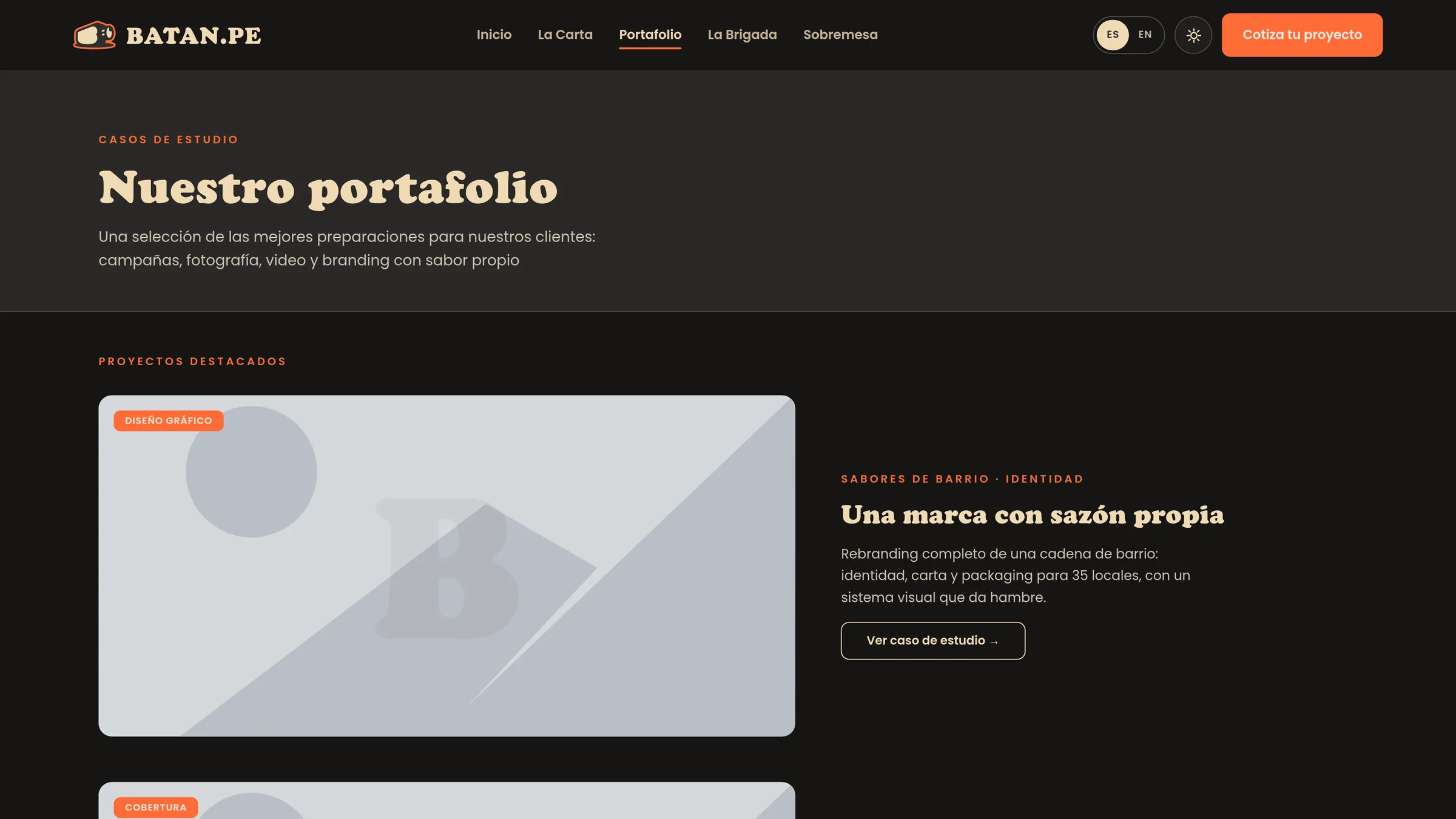
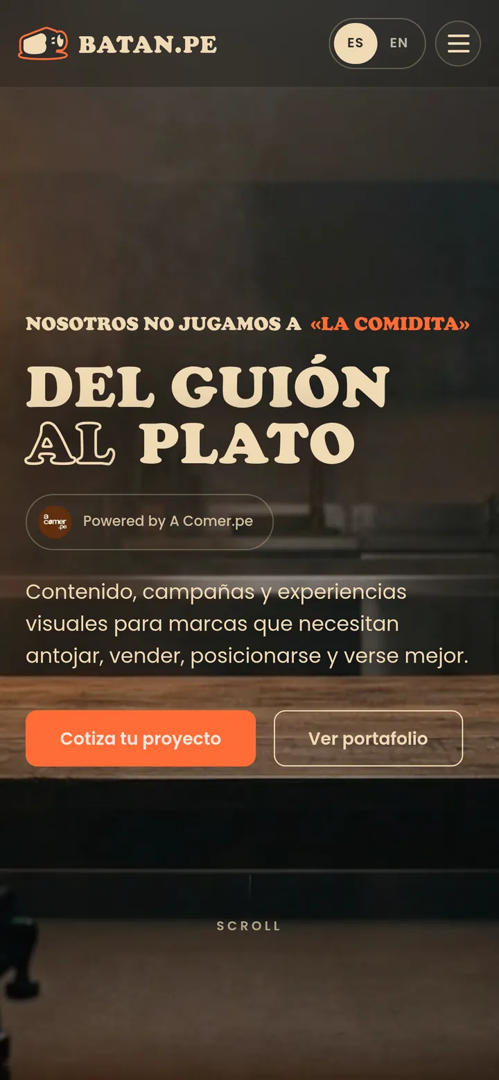
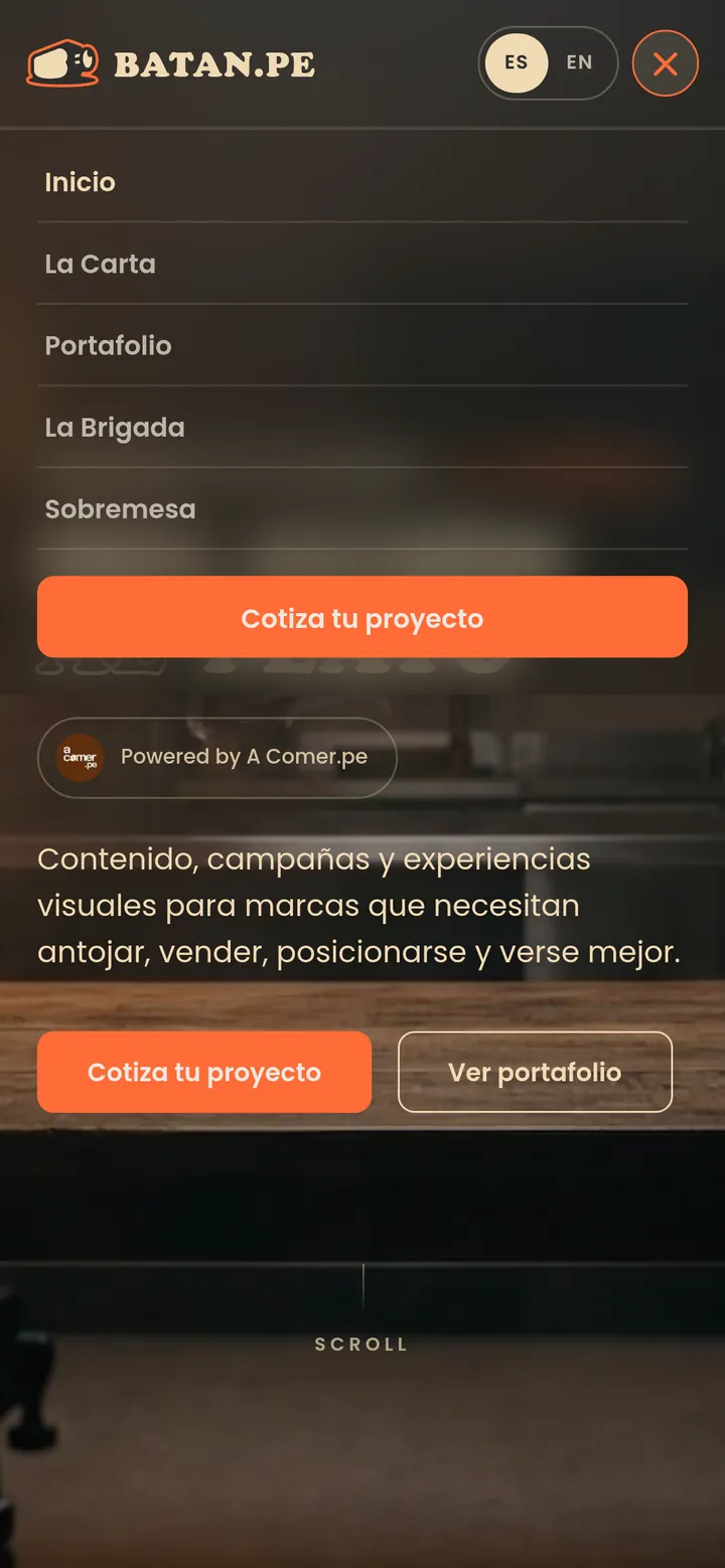

What you see on this page are live samples: individual pieces of the system, chosen to tell the case.
The full design system, v2.2, belongs to Batan and is in its hands.